don’t mess with mister inbetween (1996)

This was an exhibition I curated for Culturgest, Lisbon. Two years after the dissolution of apartheid in South Africa, the show brought together the work of fifteen South African artists. The title of the exhibition was borrowed not so much from the Johnny Mercer song, as from Homi Bhabha’s appropriation of it, in a bid to shed the binary terms that had marked South African culture under apartheid. Curated with the assistance of Ângela Ferreira.
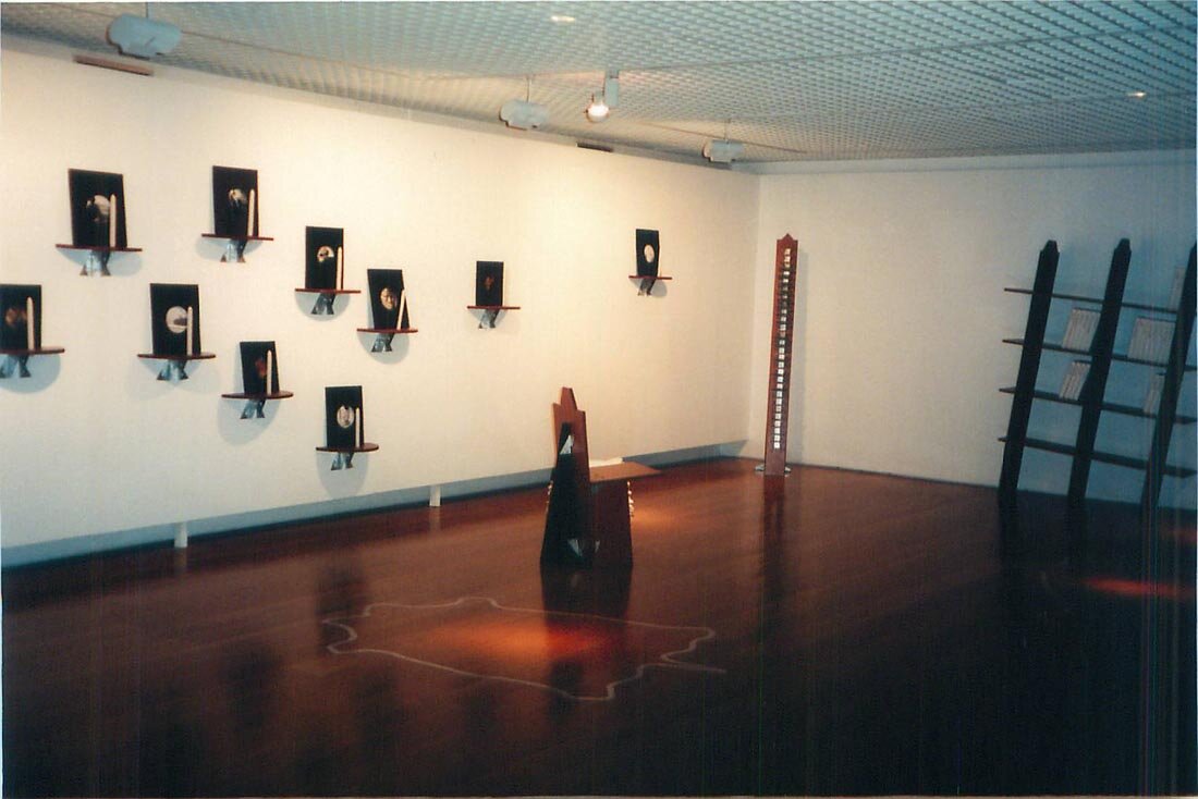
Reviewing this exhibition and my scant and inadequate documentation of it – this was before digital technlogies had proliferated – I have gathered some of the available data here (and don’t we all look so young in the après photographs!); the catalogue text, now out of print, appears HERE, slightly revised.
The Artists/The Works
Willem Boshoff — Blind Alphabet ABC

Willem Boshoff is an obsessive collector of words: his work deals with books, dictionaries, definitions, cryptic typographies, specialised terminologies, translations. The intricate conceptual articulation of his long-term projects is allied to a sensual physicality and highly polished craftsmanship.
There is a political dimension to Boshoff's driven concern with language: it lies in the fact that the acquisition of language is directly linked to empowerment. This is implicit not only in projects dealing with the eleven official languages in South Africa, but also in the suggestion in all his work, that the holder of the secrets of language is a wielder of very particular forms of knowledge. By extension, the act of translation, say from one language to another, or from tactile to visual registers, is an act of bridge-building in which the agent is empowered as a mediator.
Harnessing his insomnia to an implacable need to work, Boshoff plays on the dim edge which separates dark from light: meaning from nonsense. The works themselves are at once rebuses and obstacles. They play on the twinned meaning generated by two mythological figures, both named Hermes: hermeneutic, and hermetic, the one providing access to meaning, the other occluding it.
Blind Alphabet ABC is a complex project aimed, in the artist’s words, to “redress the place of blindness as an unfortunate metaphor for ineptitude and ignorance.”Boshoff has created a morphological alphabet accessible only to the blind: in an inversion of roles, it is the blind that act as mediators for the sighted. The work thus enables sighted visitors to benefit from the touching and reading skills of blind guides. First (in 1991-2), the artist collected words whose meaning was exclusively morphological; in 1993 he began sculpting each word into descriptive forms in wood. These carvings were executed at the pace of one a day; the 338 sculptures, correspond to the letters A,B and C. The sculptures are hidden from view by their placement in boxes where gallery rules prevent sighted people from opening them. An aluminium Braille plaque covering each box provides a verbal essay on the morphological term.
On show here are 45 words, corresponding to section of the letter B (babery to biparous). The units are placed closely in a disposition that the artist compares to a cemetery, disorienting for the sighted but providing easy and reassuring access to the blind, who can only read one form at a time. The blind ‘enlighten’ the sighted by translating the Braille text: ‘by their special magic they dictate the most abstract texts through their fingertips.’
Lien botha and Rayomond Smith: Krotoa’s room
Translation is also a central metaphor in the work of Lien Botha and Raymond Smith, her architect husband. The project began with Smith's design of utility furniture.
Low-cost and easy to construct using readily available materials and simple mounting instructions, it addresses serious social issues in a context where housing is such a great problem in South Africa. Around this furniture, a dialogue with Lien Botha began, and a narrative constructed. Like Smith, Botha uses readily available and recycled materials.
Krotoa was a Khoi woman who was employed as a translator at the household of the Dutch settler, Jan van Riebeek. Acting as a bridge between the local Khoi people and the Dutch, she adopted western dress, was baptised and embraced the traditions of the church, marrying a Danish immigrant. When her husband died and when the Van Riebeek household left, she is said to have turned to drink and prostitution. Lore has it that she was exiled to Robben Island, which already in the 17th century was a geographical articulation for the status of pariah or outcast. Botha's photomontages play on the superimposed meanings of coloniser and colonised, settler and dispossessed. The animal-like physiognomies that result from the superimposition of the faces of Krotoa with that of Maria van Riebeek, suggest that there is no necessary or essential bond of womanhood linking them, but rather, that race and class divide them.
Botha and Smith show Krotoa to be doubly marginalised, on grounds of both ethnicity and gender (it is after her husband dies that her legitimised relation to western culture is severed). The mythology around the Khoi peoples (they are represented as dumb, brutish, idle and uncivilised) is undone here through a votive sense of solemnity and also by the ironic use of Afrikaans words printed on boxes on the leaning bookshelf. The irony is emphatic when we remember that Afrikaans, the language of the settlers, only achieved legal recognition in 1918 from a redesigned and purged Hotnotstaal (Hottentot language). The punning of these compound words that Botha employs is not properly translatable, but the literal meanings of some of the words are: genadebrood —bread of charity; geslag — slaughter or gender; skipbreuk — shipwreck; volksbesit — heritage; goedkoop — cheap; verplaasbaar — removable; plaaslik (local — a ‘plaas’ both a place and a farm); tafelgebed — grace.
Lisa Brice: Safe Home

The double marginalisation of black women is also a concern in the work of Lisa Brice. The pieces shown here were part of a larger installation entitled Make your Home your Castle, shown at the Castle in Cape Town in 1995 in the exhibition Scurvy — The Secret Seven.
The Castle was the bastion of apartheid value and was later used as a highly charged exhibiting space. Brice's work in the early 1990's had dealt with the stereotyping of women's bodies in sexual fetishism and pornography. The present work extended the critique to the particular role and representation of women in South Africa. Casting an ironic glance at the traditionally homely role of the volksmother (the mother of the people) under a plaque — ‘what is a home without an armed mother? — it reiterates the race and gender division that cleaves South African society, relegating domestic labour to black women, the split destinies of ‘maids and madams.’ The suggestion of domestic order in the pieces on show — neatly ranged armchair and coffee tables, embroidered pillows, little vignettes — are all indices of female labour.
The metal grid of which the furniture cut-out is made, the window bars, the warning signs on the floor-mat and embroidered on the pillowcases, are reminders of the extent to which the ‘safe home’ has become a prison. In the context of the police state, the term ‘security’ is more threatening than reassuring: we are reminded too of the safe houses that gave protection to political activists. In the two-dimensional use of metal, as if drawing with it, Brice splices together the clean-cut lines of Pop Art with the familiar forms of local safety bars, while also alluding to the vernacular forms of wire toy-making.
The gerundive form of the verb — learning — in that trick performed by the English language, makes for a neat paradox: are we learning history, or is this the history of learning? The word ‘float’ is buoyed up on the wall and, with the inevitable suggestion of ‘floating signifiers,’ reminds us that this learning project can only be open-ended. In Nadine Gordimer's novel The Conservationist, a black corpse keeps floating up out of the earth; ‘float’ here is the signifier that points to the insistence of death in the history lesson. It will not disappear.
Death is at the heart of this austere installation. We are made to think of crowd scenes — football matches, uprisings of the discontent, police brutality: the appearance of blanket-shrouded figures is never good news. There is a physicality and presence about these four figures, whose deaths are represented by being hidden. They hover uneasily above the ground.
The soccer ball which makes the ‘o’ of ‘float’ is itself a floating object, linked to the sports euphoria in South Africa, and the obsession, in the national mythology, with such brutal rites of passage into manliness as sports and military conscription (prior to 1994). In South Africa, segregated sports expressed the omnipresent anxiety about the body and its boundaries; while the militarisation of male sports and rituals of male bonding legitimised forms of same-sex contact otherwise scorned by a culture of machismo.
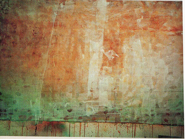
The figures painted on the wall in ferric nitrate derived from elongated projections of cave painting. Ferric nitrate (rust) is traditionally associated with the patina on bronze sculpture: and it is patina that ostensibly narrates the history of the sculpture, its duration and durability. Here, ferric nitrate is removed from its covering role, to become an autonomous but changeable material (when it is painted onto the wall, it is transparent), a suspended sign of change through time.
marc edwards: Learning History

The gerundive form of the verb — learning — in that trick performed by the English language, makes for a neat paradox: are we learning history, or is this the history of learning? The word "float" is buoyed up on the wall and, with the inevitable suggestion of "floating signifiers", reminds us that this learning project can only be open-ended.
Death we know, is un-representable. In this austere installation, one is reminded of crowd scenes — football matches, uprisings of the discontent, police brutality: the appearance of blanket-shrouded figures is never good news. There is a physicality and a haunting presence about these four figures, made representable by being hidden. They hover uneasily above the ground. In Nadine Gordimer's novel The Conservationist, a black corpse keeps floating up out of the earth; ‘float’ here is the signifier which points to the insistence of death in the history lesson. It will not disappear.
The soccer ball which makes the o of FLOAT is itself a floating object, alluding also to the sports euphoria in South Africa, and the obsession on a national level, with such brutal rites of passage into manliness as sports and military conscription. In South Africa, segregated sports expressed the omnipresent anxiety about the body and its boundaries; while the militarisation of male sports and rituals of male bonding legitimised forms of same-sex contact otherwise scorned by a culture of machismo.
The figures painted on the wall in ferric nitrate on the wall are derived from elongated projections of cave painting, introducing a touch of lyricism and another temporal dimension to the work. Ferric nitrate (rust) is traditionally associated with the patina on bronze sculpture: and it is patina which ostensibly narrates the history of the sculpture. Here, ferric nitrate is removed from its covering role, to become an autonomous but metamorphosing material (when it is painted onto the wall, it is transparent), a suspended sign of change through time.
Kendell Geers: title witheld

Kendell Geers sees the pleasure principle governing the production of aesthetic objects as a form of hedonism; his aim is to keep the pleasure principle in check by the introduction of the reality principle. Geers' conceptual choices are governed by criteria that emphasise the fusion of aesthetics with ethics: without the latter, the former becomes mere dilettantism.
His critique of South African politics often takes the form of a play on self-congratulating, legitimising schemes (news items, quota systems, affirmative action). Title withheld (Score) is an ironic take on the absurd arithmetic of hidden quota agendas present in many South African cultural events; while his Curriculum Vitae, a droll narrative of the self-as-anti-hero, seems to be a paraphrasing of the pessimism and despair implicit in the title of Bloke Modisane's book Blame me on history. The work served as the logo for and emblem of the exhibition.
William Kentridge: Colonial Landscapes

William Kentridge's work in animated film and theatre has explored an analogy between the anatomical body and the body politic. This analogy is played out against a landscape that is also a boundary: the Johannesburg city limits with mine tips, drive-in screens (a nostalgic anachronism) and scrap yards: the waste products that exist at the limit of the urban body.
The six Colonial Landscapes exhibited here are unusual in his oeuvre: no longer the city's edges, they are uninhabited landscapes, prospects where the human narrative is implicit rather than determining. Deriving from some of the drawn landscapes in the artist's production of Faustus in Africa these drawings allude to the printed images of Africa prevalent in 19th and early 20th century typographic landscapes in picture books such as Boys' Own: English children's books of what the colonies looked like.
If the initial images on which these drawings are based were already steeped in ideology — the distance of viewing point suggesting the notion of prospection and surveillance while maintaining intact European conventions of landscape representation — Kentridge's images are several times mediated. Their discreet irony resides in this mediation. The vignetting of the images adds a further nostalgic suggestion of re-presentation. And if the sensual, sooty, velvety markings of charcoal on paper are analogies for the graphic marks of the source-etchings, the red crosses on the surface suggest an alien space: the point from which the survey is taken and marked up for imperial knowledge. This suggestion of measuring and taking stock not only suggests the distance between the scene and its viewer, but also figures the landscape as targeted.
terry kurgan: Untitled
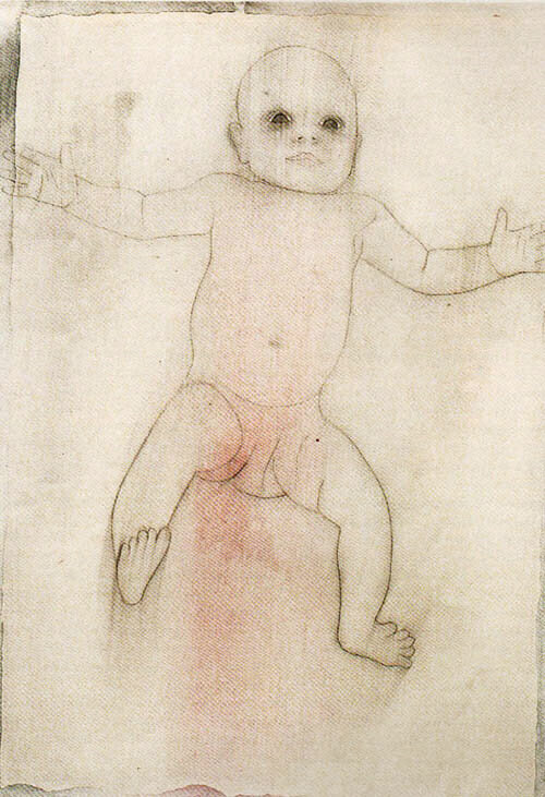
The babies are all female. Incisively drawn in graphite/charcoal, with an occasional flush of coloured pastel (blue or, more frequently, red/pink), they float in space, exerting a remarkable presence and physicality. In a body of work characterised by the idea of repetition and similarity, it is the small changes that make a difference: alterations in scale indicate proximity or distance; bodily and facial inflections a state of alertness or withdrawal.
The pink babies look robust; those dusted in blue suggest the fragile and liminal state of babyhood — alive but only just, or, as the artist puts it, ‘the way newborns look, between being and not being.’
Within this state of liminality, femininity too is represented as a violable threshold. One becomes scarily aware of the baby's sex, swollen and vulnerable: it underlines not only what we already know, since Freud, about the sexuality of infants, but also the projected potential for all those other states of transition that befall the female body, and that find their locus in that zone: pleasure, danger, menstruation, birth, menopause. The rounded presence of these baby girls, allied to their extreme vulnerability, underlines the extent to which unspoken loss is written into family relationships: each moment of embrace is also steeped in the threat of its own passing. The impulse to record the presence of this baby — the artist's daughter — is like the impulse to make family albums, simultaneously puncturing and holding time.
Moshekwa Langa: Untitled

Akin to artists such as Kcho or Jimmie Durham, Moshekwa Langa uses the principles of collage and bricolage, not only as constructive metaphors of cultural fusion, but also as a form of disruption. He interrupts any fluid re-construction of handed-down narratives and simple stories (of progress, of material uniformity, of singular origins).
There is a roughness and disdain for aesthetic hierarchies in the way Langa's pieces are put together, suggesting an urgent and expedient use of anything that is to hand: books and maps, sticks and stones, debris and documents. These items allow potentially disparate social and physical worlds to conflate in ways that underline flexibility and contingency, an approach that the artist associates with his own ‘oscillating between groups.’ ‘I'm not really sure that one's identity is something one can possess,’ he has observed.
The prioritisation of process grants Langa's work its ephemeral and alluringly incidental appearance. These pieces hold meaning at arm's length, remaining stubbornly untitled, but heavy with latent meaning. In No title (skins), the cement bags hanging on washing lines are violent reminders of flayed skins. There is similar aggression in the wrapped and sealed telephone directories attached to metal clothes hangers. The slimness of the directories reveals their origin to be from small and implicitly remote places. The wrapping tape and black plastic that occlude these books from both sight and touch, function as succinct visual metaphors for the censorship practiced during the apartheid regime. As in Gavin Younge's work on this show, the idea of covering up an object serves, paradoxically, to reveal more about its content: ‘if you're trying to keep secrets away, they have a way of becoming more visible,’ Langa has observed.
Pat Mautloa: Untitled
The impetus behind Pat Mautloa's work is to work with found materials — in this he is akin to Moshekwa Langa. However, Mautloa's works perform a more literal narrative.
The found materials register the physical and geographic dislocation from one part of the city to another, from home to studio (and the transit from ‘black’ to ‘white’ urban areas). Mautloa's earlier assemblages in metal incorporated a more direct allusion to the material vestiges of the violence of urban life in South Africa (scarred and battered surfaces, corroded edges, bullet holes). The present work nevertheless discretely maintains these allusions to the violent and makeshift quality of township life.
While absorbing the structure, equilibrium and uniformity of the modernist grid, the insistent narrativity of Mautloa’s work prods through its materiality. The layers of gauze, through which the grids are structured, suggests not only a formal binding to the flatness of the surface, but also an action of healing and repair. The transition between transparency and opacity establishes a threshold, a place where interiority and exteriority intersect.
Santu Mofokeng — The Black Photo Album: Look at me (1890-1950)

The photographs presented here by Santu Mofokeng are part of a research project about the self-representation of black working- and middle-class people in South Africa in the years 1890-1950. Mofokeng chose this period, since it coincides with the time when, in his own words, ‘the world went to war twice and South Africa was busy articulating, entrenching and legitimating a racist and oppressive political system that the United Nations identified as a crime against humanity.’
These re-photographed found images are presented with as much documentation as Mofokeng is able to garner. Drawn from the private rather than public domain, they represent personal and familial aspirations, and as such, they are objects used as tokens or trophies of status and self-worth. With their sitters smartly attired and placed squarely in the format, addressing the photographer with solemn gaze, and with their neatly arranged interior settings and occasional props (a walking stick, a skin rug), these photographs operate as mnemonic triggers within oral family narratives (‘this is my great grandfather…’). Whether treasured or discarded, these photographs point to discursive narratives within families and broader social groups.
One of the aims of Mofokeng's work is to create an archive that operates as an alternative to the official archive that documents this period, in which black people tended to be represented ‘in their natural habitat’ by white photographers, employing representational tropes of difference. In those conventional representations, black people are designated as ‘natives’ belonging to the ‘great family of man,’ and as such, are deployed in order to enshrine a reassuring classificatory knowledge.
Jo Ractliffe — reShooting Diana

Like the work of Santu Mofokeng, that of Jo Ractliffe underlines the constructed nature of photographic images, the ways in which photographs become sites for memory. I
The idea for this project came about when Jo Ractliffe's cameras were stolen. A friend gave her a toy camera — the kind called Diana. It has a plastic lens, fixed focus, and the only exposure control is a lever marked ‘sunny’ or ‘cloudy’. Ractliffe used this camera in a desultory way to photograph things here and there: landmarks, certain drives, places that had a resonance for her from childhood. The fixed focus gives the chosen motifs a kind of arbitrariness that challenges conventional prejudices about what a photograph should be. This randomness is probed in motifs that show apparent non-places: not so much prospects or views, as interstitial spaces, the place between landmarks. In this way, they seem to create a gap in space, but also a fissure in time. Their transient imagery, their dim overall lighting, their fragmentary attention to idiosyncratic landmarks, the hazy vignetting within the image itself, all create a sense of melancholy that also smacks of menace. The creation of cinematographic expectation (any moment now, somewhere outside of the frame, something might happen) creates a disruptive sense of suspense. Circulating through these strange, moody images, hung placed back to back within their glazing, one feels a haunting, not so much by the ruins of childhood, as by the ruined nostalgia that regards this childhood as charmed.
Joachim Schoennfeldt — 1/4, 1/3, 1/2

Much of what Joachim Schoenfeldt does is concerned with the relationship of objects to oral discourse, whether a narrative within traditional African culture, or conversations overheard on public transport in Johannesburg about the violence in that city. He explores the ways in which objects intervene in discourse: used symbolically or deictically to plump out verbal narratives or, contrariwise, inert until they are animated by language.
Schoenfeldt’s work embodies a reflection upon the shifting meanings of objects as they travel from one context to another. An example might be a mask that, in traditional African cultures, might form part of a dance ritual, but whose status is altered once it is removed from that context, to become either curio or work of art.
Showing the diverse objects as ‘an exhibition’ (rather than, say, an installation) underlines their heterogeneity. 1/4, 1/3, 1/2, the generic title, is also more descriptively applied to the three carved cows, alluding to their relative sizes. As in the work of Willem Boshoff, a complex conceptual articulation is harnessed to a loving and careful craftsmanship. On the cows, the painted landscape vignettes (with their droll allusion to the artist's own name in the caption schönes feldt — beautiful field) hark with gentle irony to the blond tonalities and flat, empty spaces, of the South African pastoral genre of the nineteenth century. In South Africa, as in Germany or America, the links between landscape and notions of national character were implicit in painting and literature, neutralising a sense of possession of the land. The multiple legs of the cows perform a paradoxical violence, preventing the animal from movement in any direction.
Violence is also implicit in the round wooden plaque, with its invitation to drive a square peg into a round hole. Like the cows, the object is not an autonomous, aesthetic object, but functions as a marker in oral narrative. Likewise, the photographic piece What I see and what I do registers, as though through peripheral vision, the agency or vestiges of the violence of Johannesburg through the artist's daily travels, on public transport or by foot, to and from his studio.
Penny siopis: Eight Works
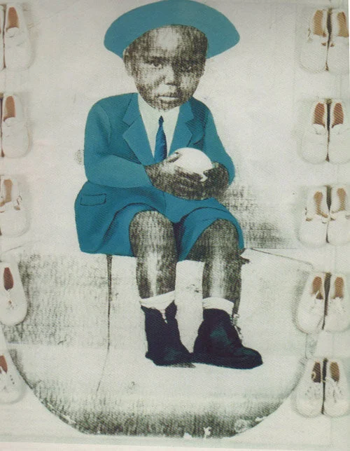
Penny Siopis brings to the dense theoretical underpinnings of her work an unabashed and sensuous materiality.The sources for this body of work are very particular artefacts: they are hand-painted photographs in which the sitter provides a photographic portrait, head only; the body, suitably attired, is painted in.
So, a young couple might request to be portrayed as bride and groom; or twins might be shown in their best party frocks. These photographs circulated in the private domain, presumably many were sent back home by migrant workers in order to dignify the self and display legitimated urban status. Under the sign of the real, the photographs invoke a sense of dignity that is, at the same time, indicative of the sitters' need to control their own representations. As objects of desire, they represent an image of wholeness and social integration. Their significance, as Siopis points out, is to ‘visualise the importance of the family and of relationships within the family’ — affinities, alliances, allegiances.
Penny Siopis, whose work has often dealt with the relationship between self-representation and the complex politics of the representation of otherness, has filtered the source material and distanced it through the use of enlargement and monochrome. Like the first painter who intervened on the photographic surface, she adds colour by hand, as well as collaged objects that disrupt the continuity, both physical and semantic. These objects, metonymically or metaphorically related to the image in question, are invariably white. (The artist had explored the notion of whiteness as signifier in a video piece, dated 1995, in which white shoe-polish was painted onto the artist's back and a drawing scored into it.) Through the disruptive presence of these bricolaged objects, Siopis emphasises the paradoxical significance of white as a signifier in the discourse of race, where it is naturalised and functions as unmarked presence.
Gavin Younge - Giving the Drum Back to Europe and Sit Down, Benny

Gavin Younge, like Marc Edwards or Kendell Geers, is concerned with an articulation of multiple historical processes. Giving Back the Drum to Europe was initially conceived for Copenhagen '96: housed in a container with work by Billy Mandindi, it set up a critique of the problem of housing in South Africa, while gathering a dense web of other allusions.
Younge has undertaken research into the history of land invasions in the Western Cape, collecting data through oral histories and the printed media. Memory is constructed through an incantatory listing (inscribed on narrow metal friezes) of the names of squatter communities culled from the press.
The scribing function is re-articulated in the writing that appears on the parchment –like skin covering the car doors: at once scars and tattoos, graffiti and palimpsest, the words are punning plays on local references. Cars themselves are over-determined symbolic objects in the South African context: as status objects for the rich, they are, simultaneously, pretexts for pride and easy targets for hijackings and vandalism. In poorer urban contexts, they provide an indispensable ticket (kaartjie) to a freedom translated as mobility: distances are big and punctuated by the obstacles and barricades that are vestiges of apartheid, both visible and invisible. Communal taxis in urban centres are famous for their reckless driving and for the so-called ‘taxi wars’ they generate. Resembling the skin of a drum, the vellum tightly encases the car doors: sutured to fit like gloves over the doors, the vellum transports its own charge, at once violent and protective. The drum, which Younge suggests is a European stereotype connoting ‘Africa,’ is re-presented both as gift and as admonition.
Sit Down, Benny (the title comes from one of the books) employs a similar embalming process (stretched vellum) on a pile of books. The number of books is determined by the size of the metal trunk in which they are transported. Reiterating the idea of history as a scribe, Younge has chosen books that epitomise the apartheid ideology of ‘separate development’ and segregated education. Like Moshekwa Langa, he uses the book as a token for the construction of identity: the concealment of the books renders them objects of readerly desire, and as such, the books simultaneously obscure and memorialise.